Leafs Redesign
Apparel Design
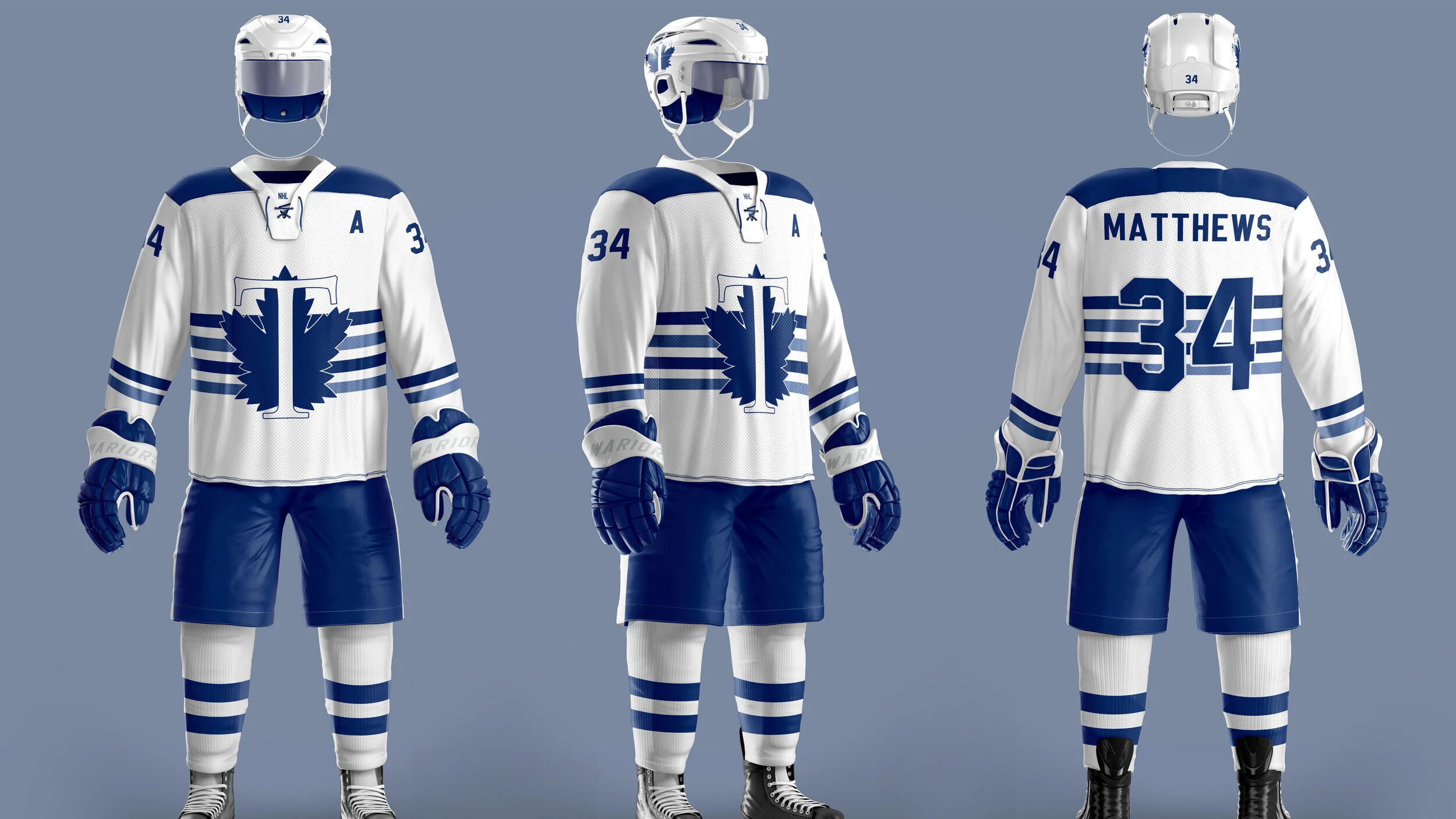
This third jersey for the upcoming season is all about paying respect to the Toronto Maple Leafs history. I wanted the design to evoke a nostalgic feel while also giving it a modern, new look. For this new jersey I kept the leaf because it’s a big part of the team’s identity. There have been changes to the leaf’s appearance throughout the years but I wanted to keep the current style of the leaf. I did this because I not only like the appearance of it but because of the meaning behind it. The shape is inspired by the 1940’s - 1960’s logo which was created to resemble the badge that Canadian soldiers wore during World War I. Its 31 points on the leaf represent the 1931 opening of the Maple Leaf Gardens. The large T is centered and the focal point for the front of the jersey, it is placed over the iconic blue leaf. The T stands for Toronto and it also pays homage to the 1918-1919 original logo for the team when they were known as the Toronto Arenas.
I kept the colours of blue and white because those have been the Toronto Maple Leafs colours since 1928 and it is said that the blue represented Canada’s sky and the white represented Canada’s snow. This new jersey is white with two shades of blue for the accents. I made it white because I believe it gives the uniform a crisper look, also it’s a reminder of the St. Pats jersey. Making it white also allows me to make the style changes I want which is adding two tones of blue into the new uniform. In doing this it creates more dimension and it is also something new to represent the team in this era. The contrast of the blues against the white jersey allow the numbers and the logo to be visible and identifiable to the viewers in the stands and watching on television. As you can see there are 4 strips in the centre of the jersey. I wanted something different, I didn’t want to follow the typical jersey design with strips around the bottom near the hem line. The four strips also wrap around to the back of the jersey and behind the numbers. These four lines are also there to represent the four name changes of the club since its birth in 1911.


